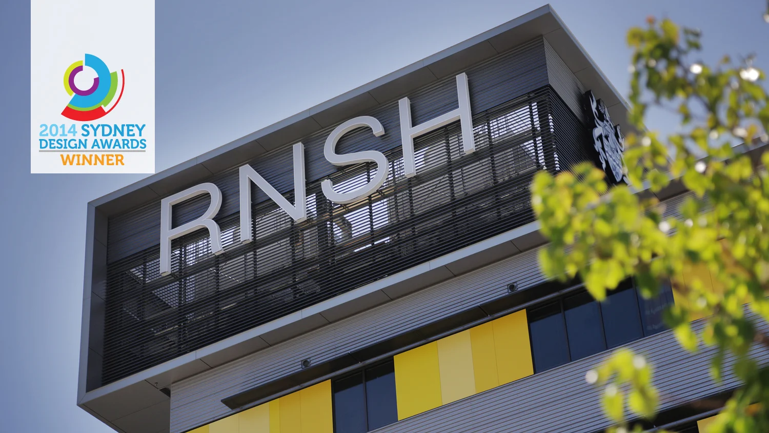
Royal North Shore Hospital Acute Services Building
Royal North Shore Hospital Acute Services Building
Royal North Shore Hospital (RNSH) is one of Australia’s leading research, trauma and teaching centres. The entire campus has been redeveloped as part of a $736 million project – the largest of its type in New South Wales history.
Given the critical nature of services provided by RNSH and the complexity of the 7 hectare site, a successful wayfinding strategy for the campus and within the new Acute Hospital building was a crucial part of the project’s outcome.
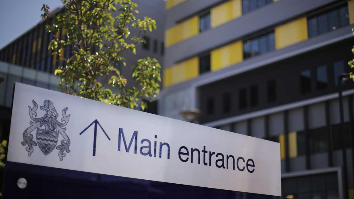
The wayfinding system takes a number of factors into account, such as the different ways people approach the hospital - on foot, in vehicles and by public transport, therefore appropriate pathways were identified with clear signage at decision points.
In December 2012, Royal North Shore Hospital (Sydney, Australia) opened the doors to the new Acute Hospital.
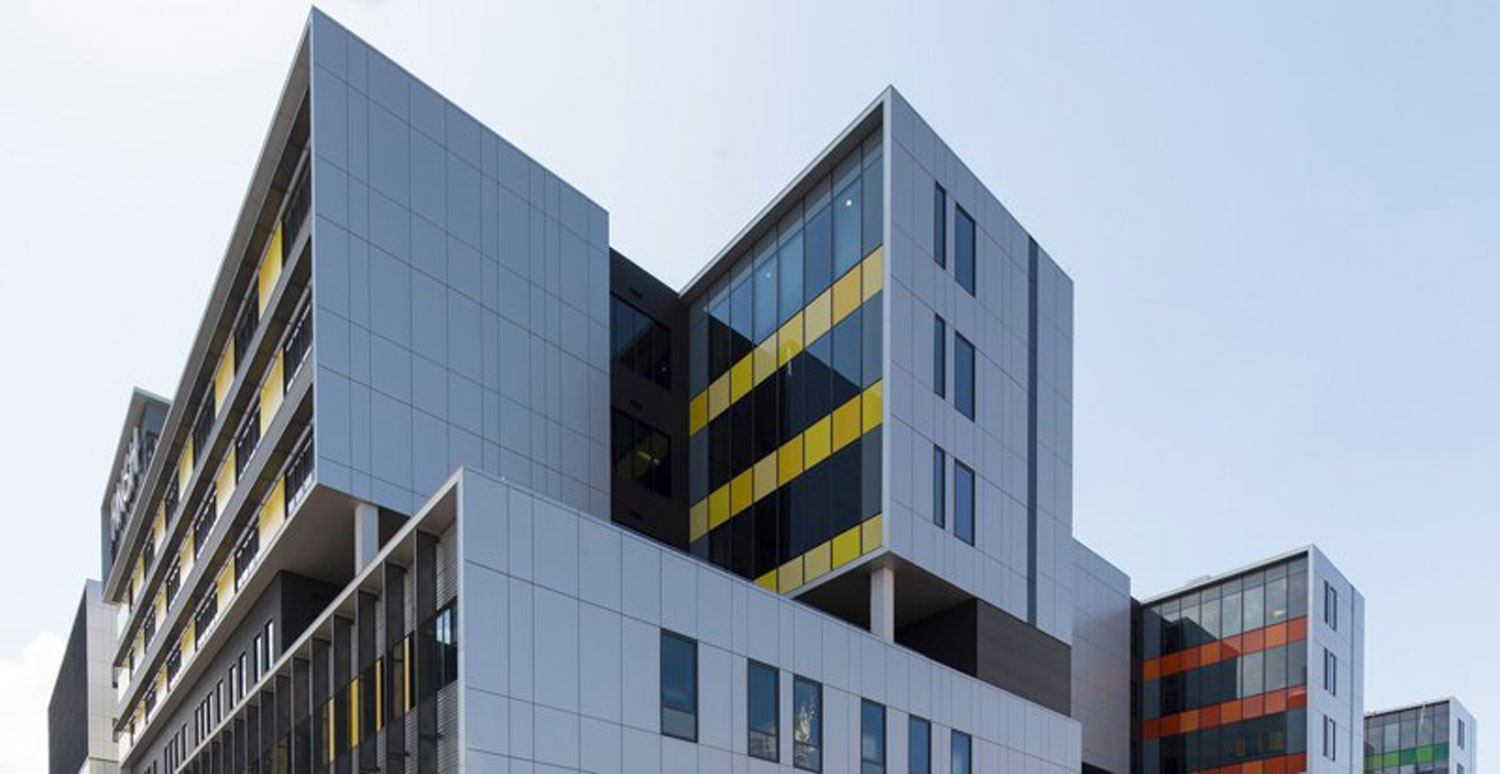
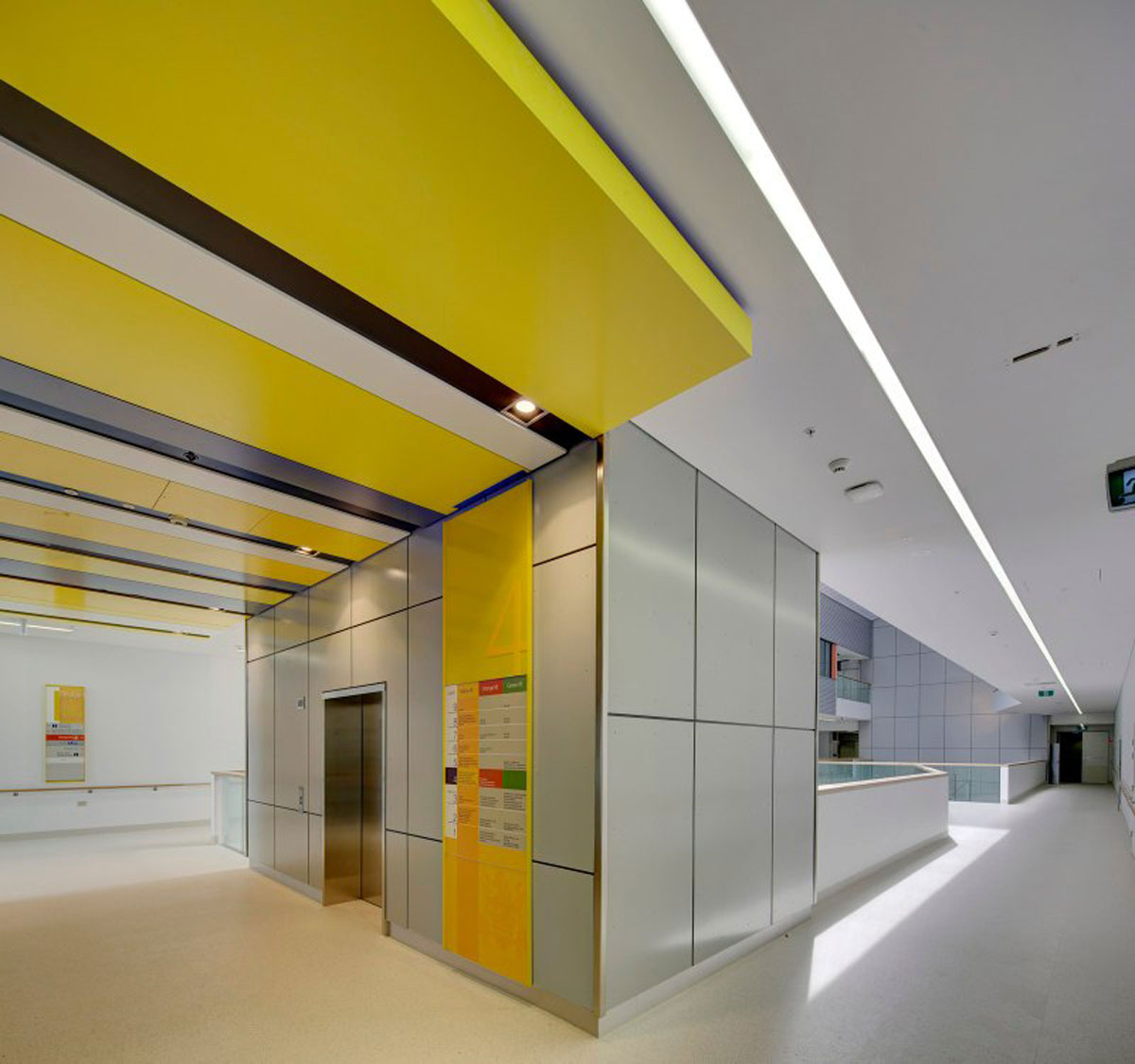
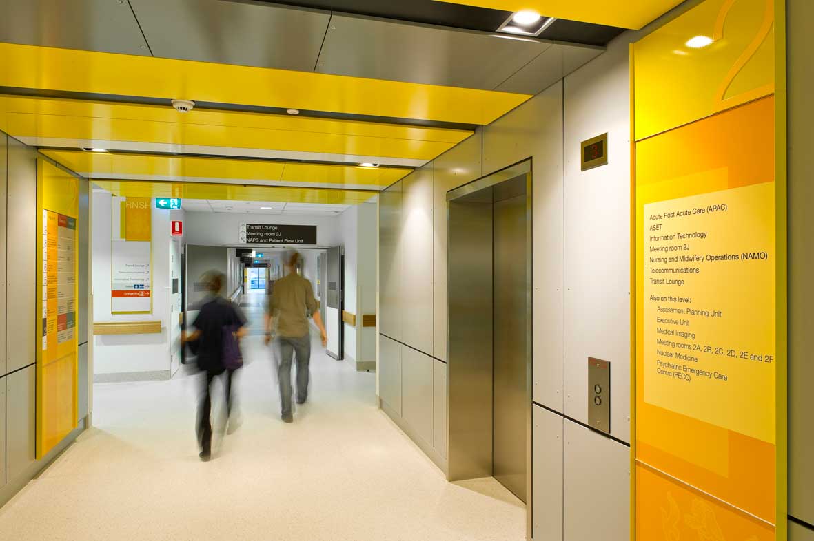
The building is clad with three bold, bright colours which are used to give the building a unique identity and highlight the 'wings' of this enormous building. Our brief was to resolve how to constitute this important visual asset into a comprehensive wayfinding strategy.
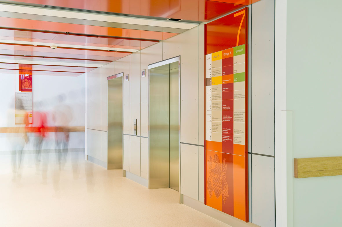
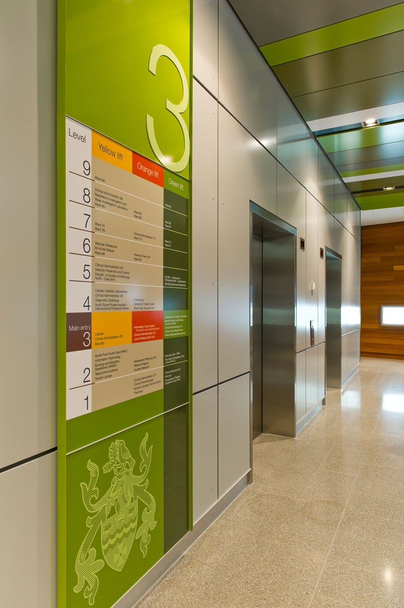
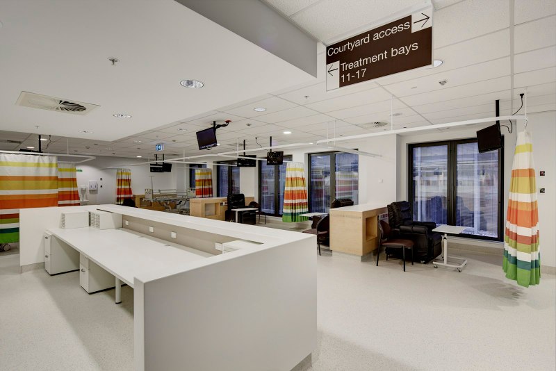
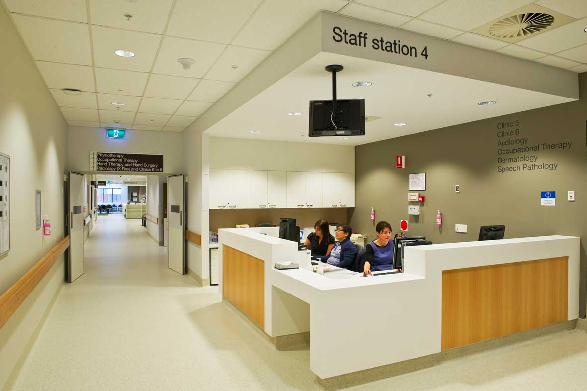
Our solution was to utilise these distinct external colours as the primary device for directing users throughout the building by linking each colour to the lift cores. This colour was then extended into the main departments and ward areas. For all other areas, including those that transitioned between the main lift cores, a neutral colour was selected as a uniting element to join the colour system together.
The colours were embraced by the interior design team and were used in internal furnishings, carpets, ceiling panels and joinery. Not only did this reinforce the wayfinding but it also provided refreshing splashes and unusual use of colour in a health environment which can be typically quite neutral.
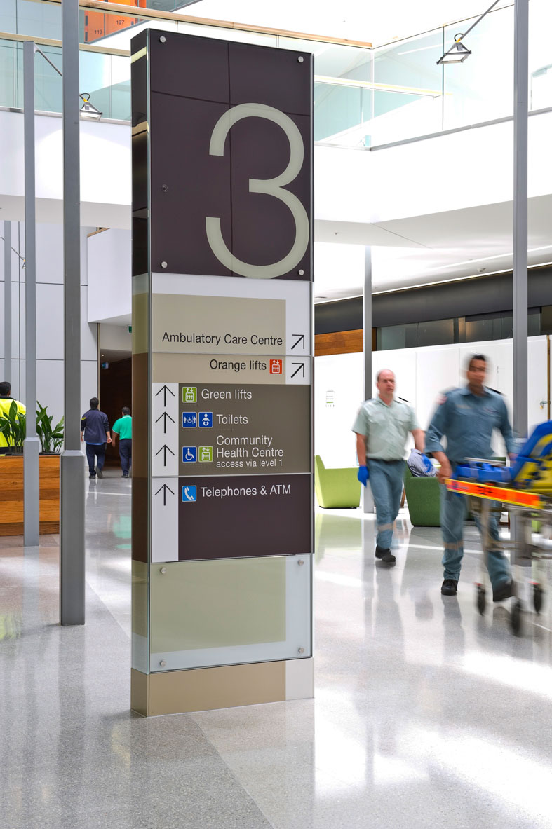
Despite the solution consistently reinforcing colour as the most identifiable element for visitor orientation, it was necessary to foolproof the system in case someone found the back door or failed to realise the colours function. For this reason every lift lobby in the hospital has two directory boards, one providing an overview of the entire hospital layout and major departments, the other more detailed information about the facilities and departments on that floor.
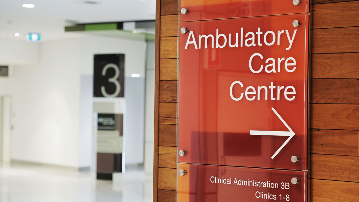
The final solution encompassed detailed design of all signage. From the main atrium to the radiotherapy bunkers directional, operational, regulatory and statutory signs were designed to work as a cohesive unit.
Search for similar projects: