NIDA Parade Theatres
NIDA Parade Theatres
After launching a new logo and identity for its Parade Theatres, Australia’s National Institute of Dramatic Arts (NIDA) commissioned a redesign of signage throughout its Sydney-based training and performance facility. The scope of works included signage for
• building identification;
• areas of the theatre complex;
• educational and administrative areas
The resulting project went beyond a simple wayfinding exercise to deliver:
• an expanded and more comprehensive signage solution that utilised and enhanced the Parade Theatres logo, and
• a theatrical design approach where sophisticated colours, finishes and lighting perfectly complement the spectacular venue and NIDA’s status as a leader in the dramatic arts.
The Sulman Award winning Parade Theatres is a high profile public building with dramatic architectural features. As a result sensitivity to architecture was a key consideration of the project and very important to the client and architect who closely scrutinised each stage of design development.
The building was originally opened with limited graphics and recent changes, including an online ticketing system and increased prominence of secondary theatres, placed extra pressure on an already insufficient signage system.
Today the building has a hierarchy of sign types that improves user experience and supports the architect’s vision.
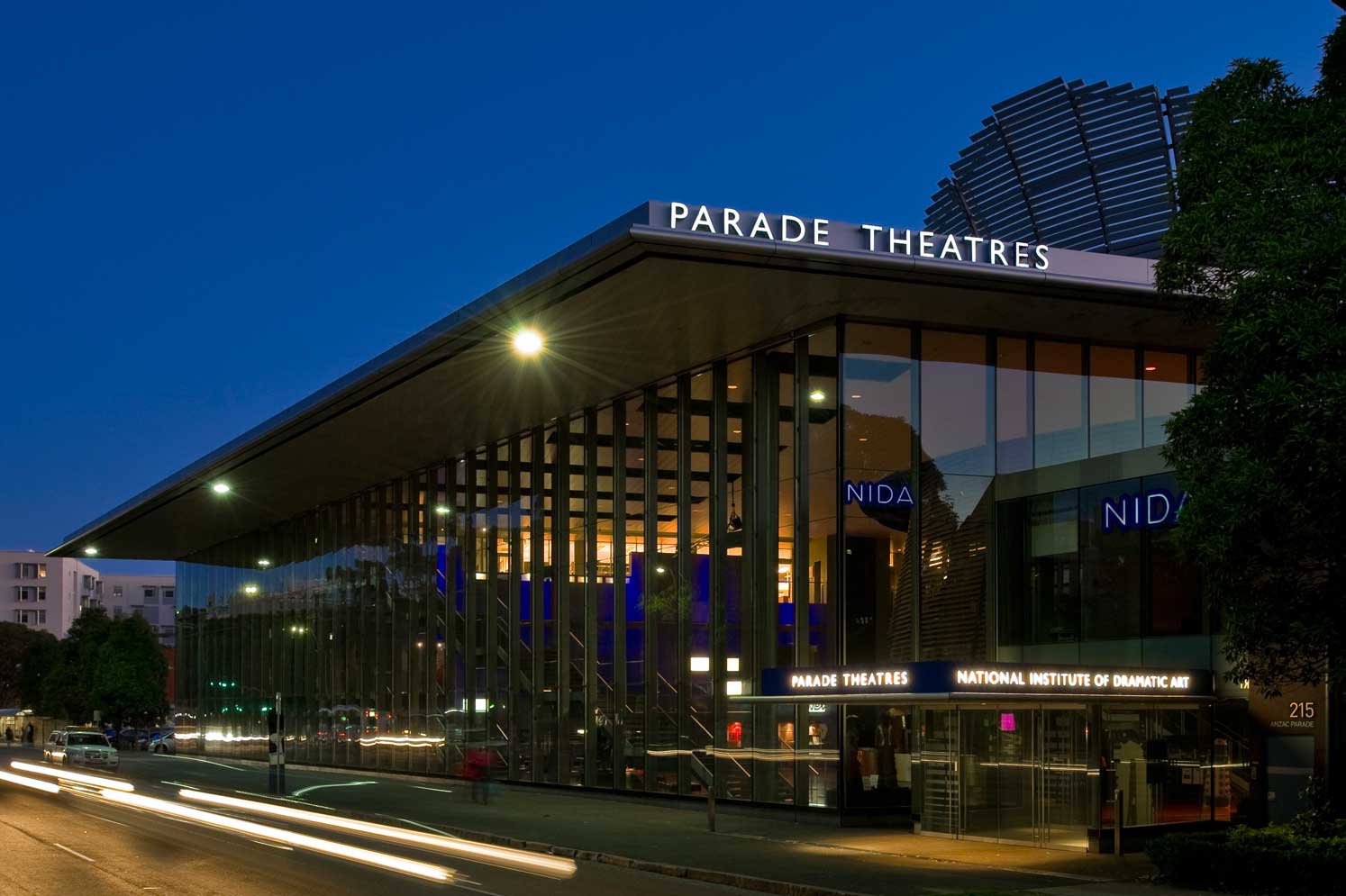
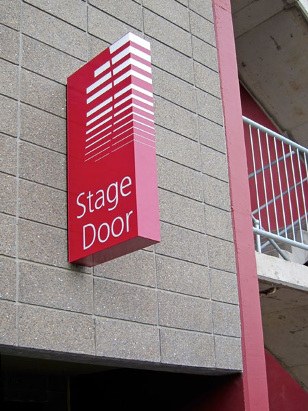
When visitors approach the building from busy Anzac Parade, illuminated signage on the parapet and porte cochere clearly identifies the building and builds a sense of anticipation. Touches such as internal illumination of the projecting stage door sign add to the drama, reflecting NIDA’s reputation as a star maker.
Within the foyer – a stunning space dominated by an imposing and brightly lit veil of louvered aluminium – colour is kept to a minimum and signage remains unobtrusive while clearly and effectively guiding theatregoers from building entry to theatre door.
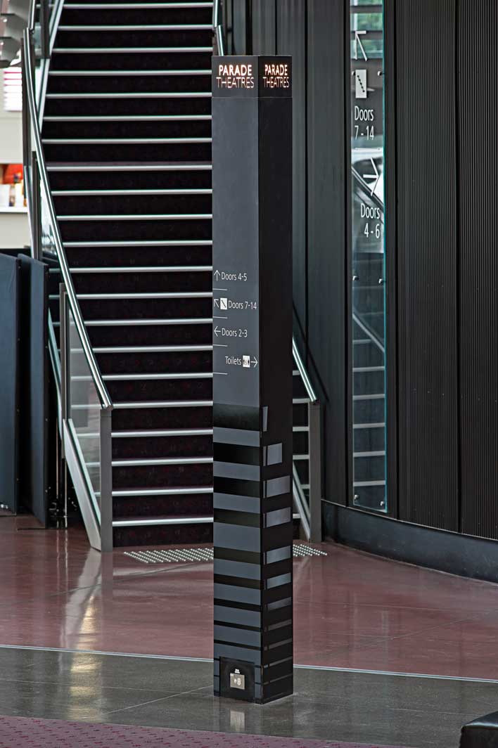
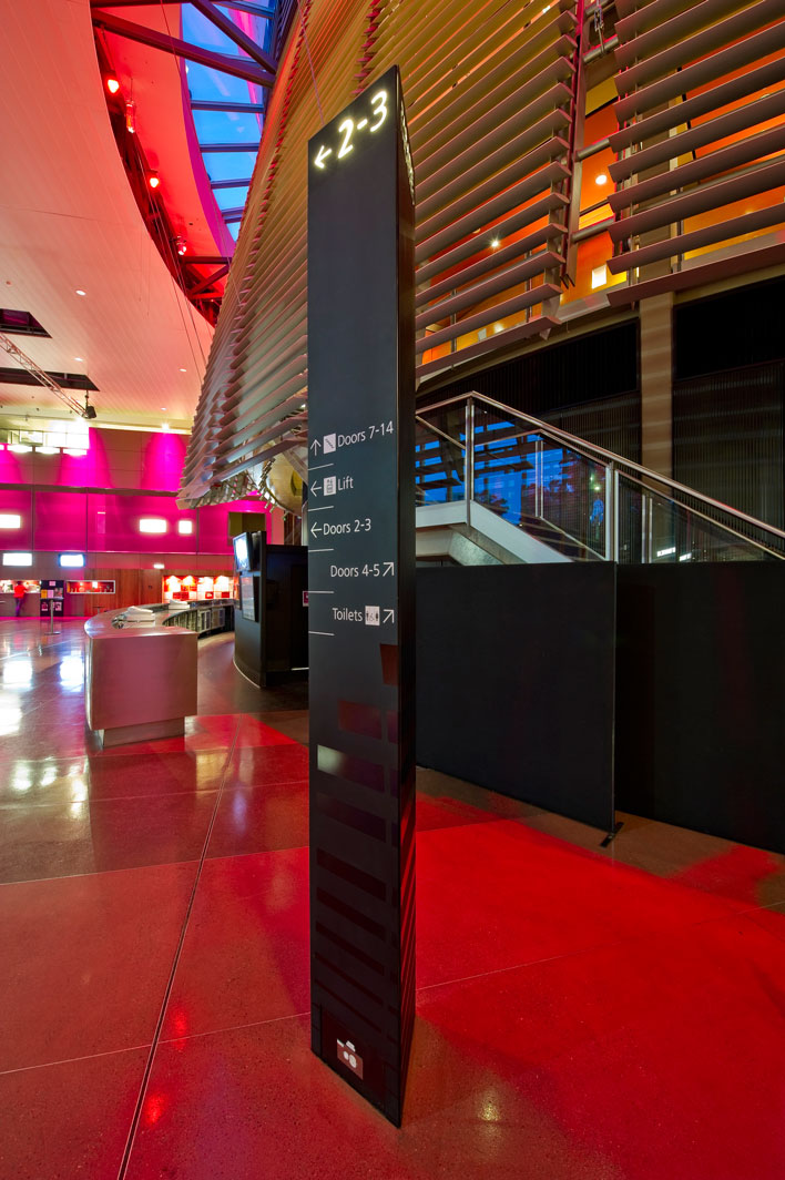
A series of three sided totems populate the foyer like silent ushers, dressed in muted matt black and enveloped with elements of the Parade Theatres logo, subtly and cleverly contrasting in high gloss polyurethane. The totems are obvious when needed, with illuminated door numbers and arrows visible over people’s heads, fading into the crowd when not.
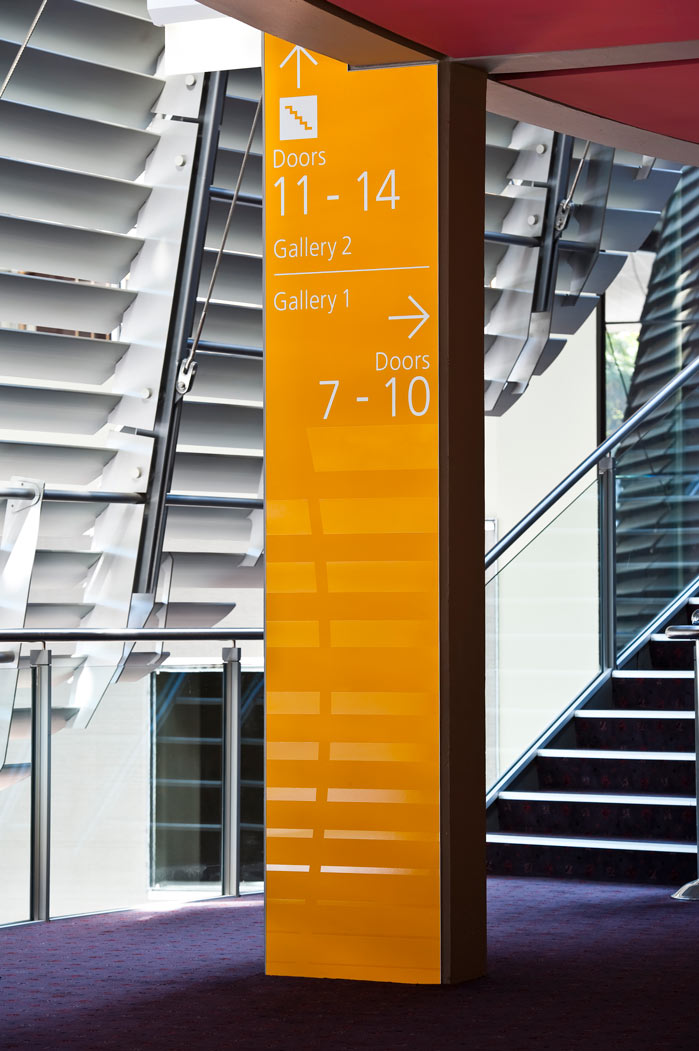
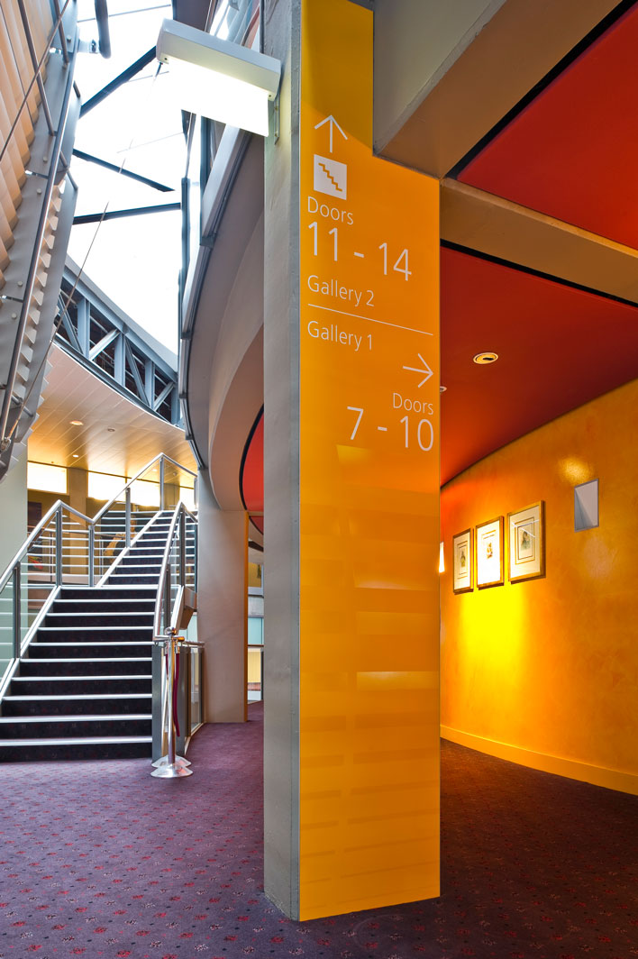
A large ‘starphire glass’ sign is fixed to the main theatre’s curved, black, corrugated wall and sign panels on the upper levels are accurately colour matched to the hand painted feature walls, allowing the graphic elements to successfully integrate with the interior spaces.
In the past secondary theatres were difficult to find but now theatre names are clearly visible and illuminated, thanks to custom lightboxes. In addition, directional messages correspond exactly with ticket information allowing patrons to effortlessly find the correct level and door.
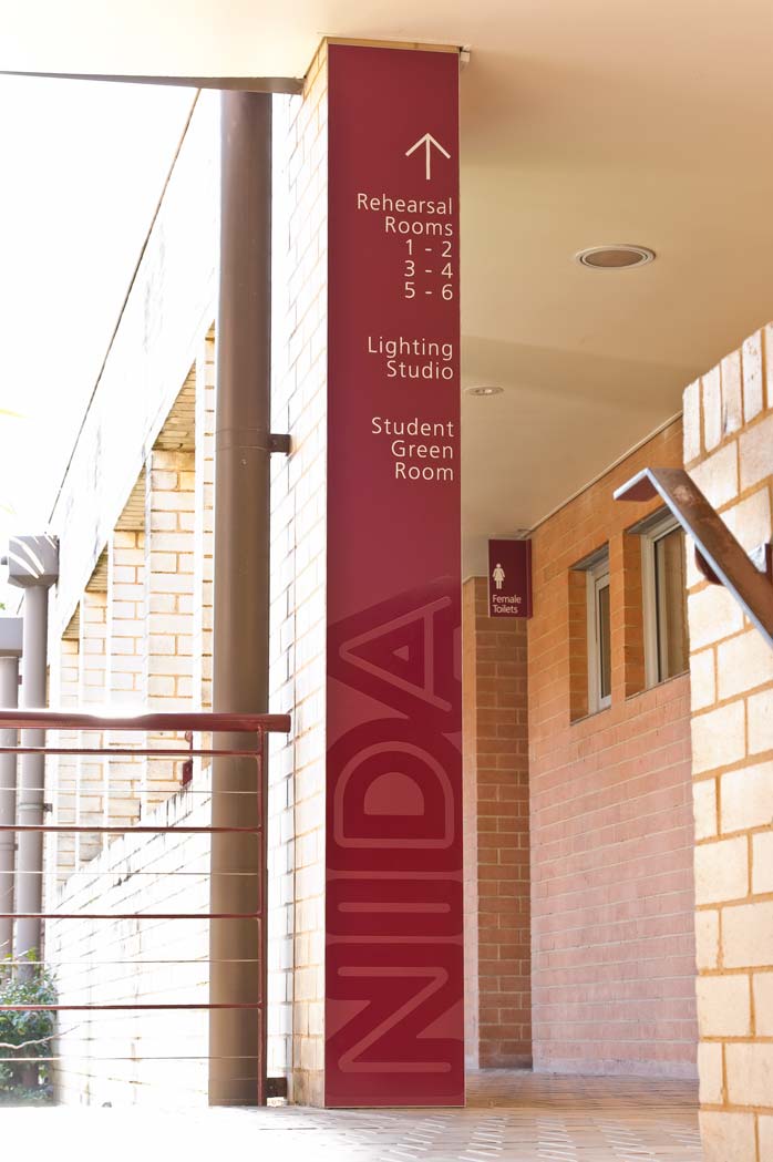
In NIDA’s education and administration spaces use of colour on signs differentiates functional areas while continuity of finishes, including a matt background with the NIDA logo layered in high gloss, link the sign families.
Given the success of the NIDA project it is difficult to believe it was achieved on a limited budget with an emphasis on using existing signage infrastructure – often to accommodate more information with the same amount of space.
Search for similar projects:
