
Royal North Shore Community Health Centre
Royal North Shore Community Health Centre
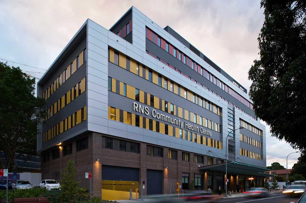
Work continues to implement the integrated wayfinding strategy across the Royal North Shore Hospital campus, and a key platform of the broader campus wayfinding strategy is to utilise existing, prominent visual cues as prompts for visitors along their journey.
In keeping with this approach, we decided that the most well known landmark for this site was the large old Moreton Bay Fig tree growing adjacent to the Community Health Centre.
Not only are Moreton Bay Figs among the most widely recognised trees in New South Wales, but trees are a powerful symbol of nurture, protection and healing – a symbol ideally suited to the function of the building.
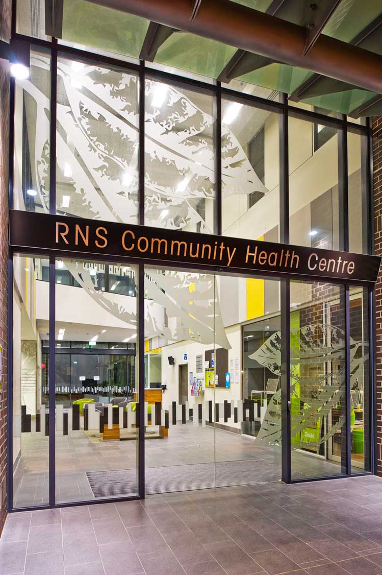
The tree inspired a suite of environmental graphics and signage which works in isolation yet integrates with the broader campus wayfinding strategy.
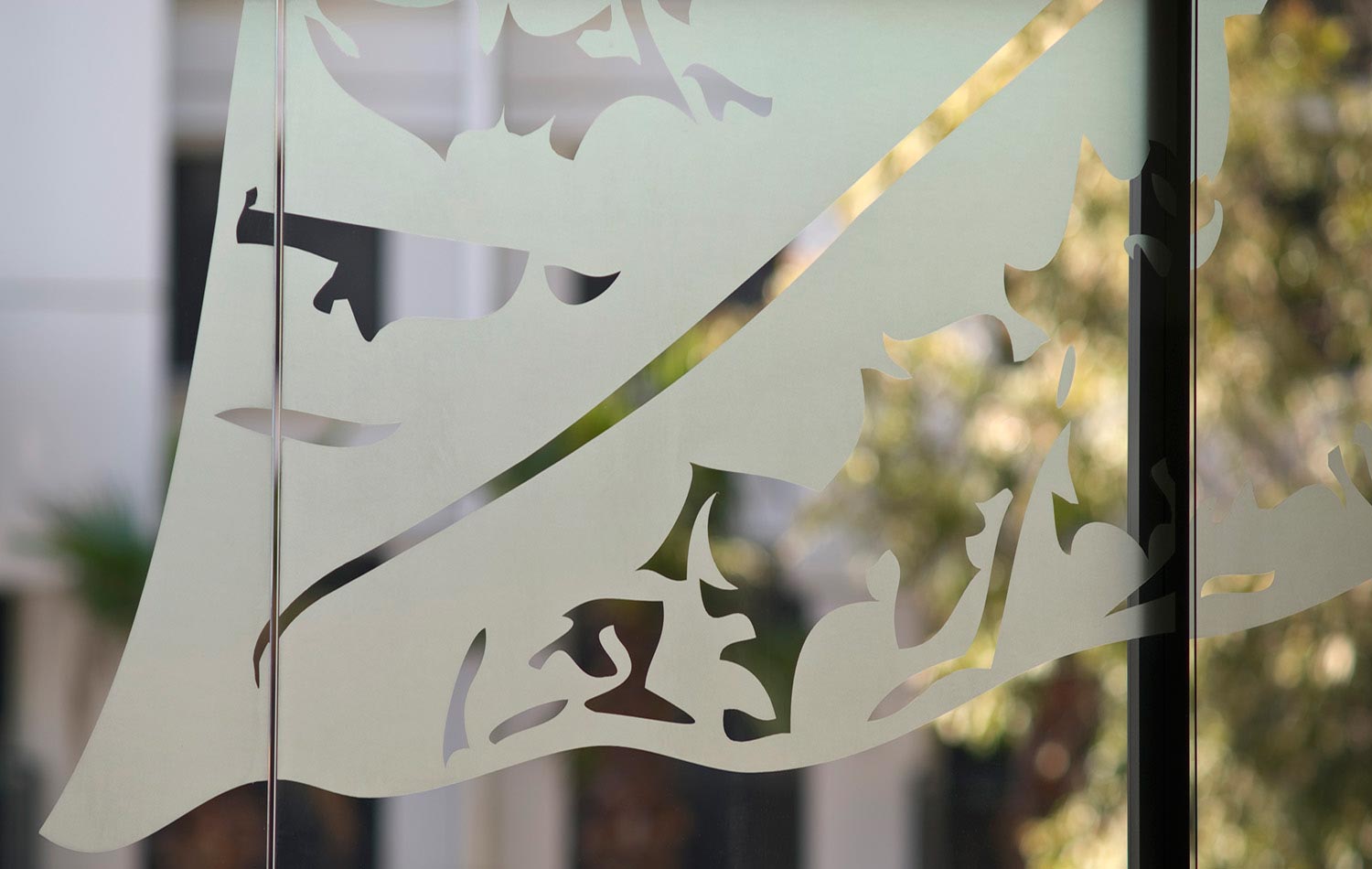
Tree themed graphic elements are arranged in a visual hierarchy where information becomes more specific and more detailed as users travel towards their destination.
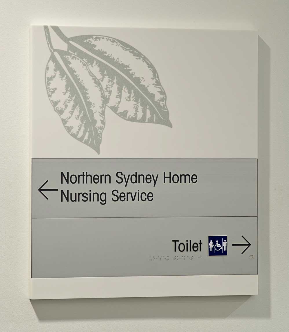
Firstly, to reinforce building identification glass entry doors feature oversized, silhouetted leaves applied in etched vinyl – giving the impression that visitors are entering the enfolding branches of the tree itself.
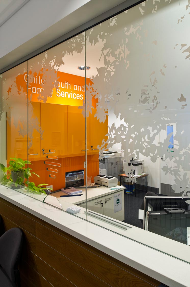
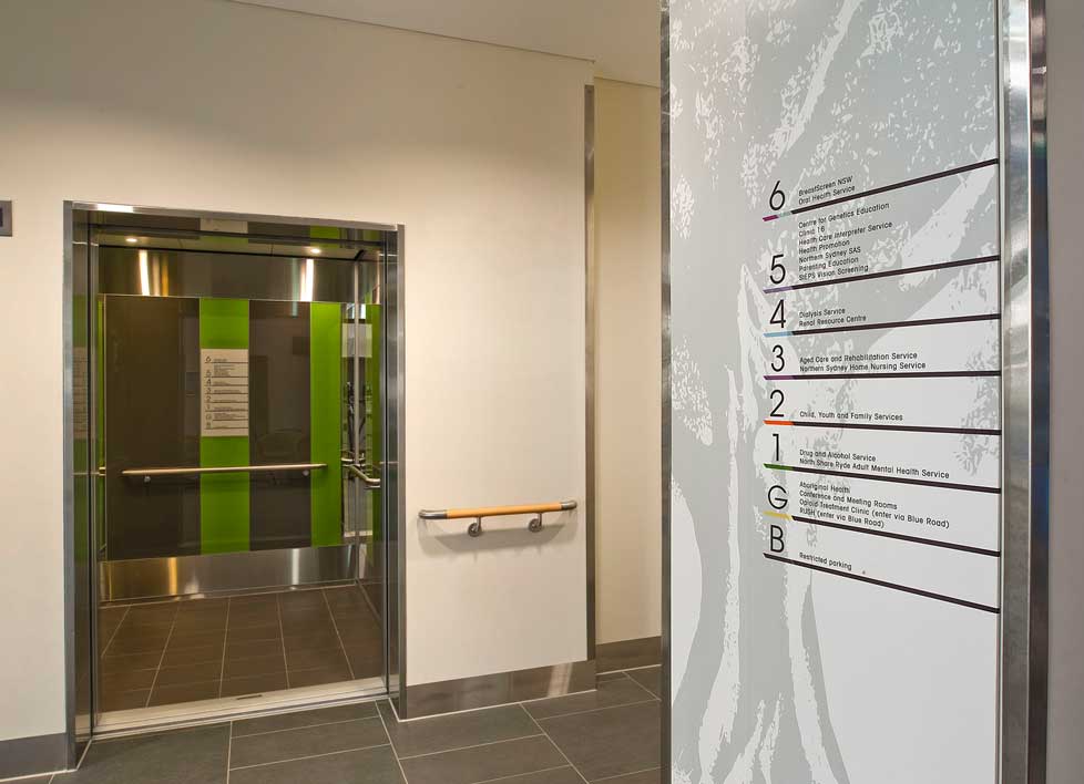
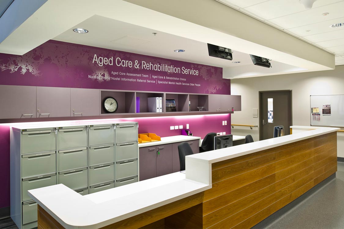
A building directory board features a solid gloss graphic of the entire tree while each level’s reception area is surrounded by a canopy of branches applied in etched vinyl to glass partitions and walls. As visitors continue their journey, foliage designs on directional signs become more detailed and in-scale, subtly reassuring users that they on track to reach their destination.
One of the challenges of the Community Health Centre project was the need to work with a bright colour scheme predetermined by the interior designer and architect. To accommodate this requirement, tree and foliage designs are monochromatic while colour is used as a backdrop for graphics in each level’s reception. Small areas of the colour corresponding to each department also appear on the building directory.
It was also important that the signage system be easy to update as the Centre evolves so a flexible, layered system was implemented. Directional and door signs have a replaceable nameplate which attaches magnetically within a custom routed slot.
Finally, special attention was given to the materials used in the project. Most of the internal signage is made from white Corian®, which delivers signs of substance and quality while also providing a lovely smooth finish which allows direct digital printing and ease of cleaning.
Search for similar projects: