Wollongong Hospital
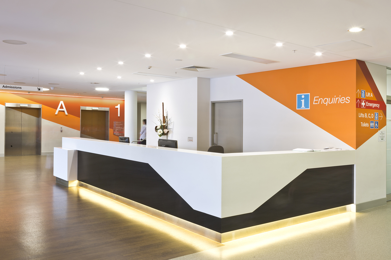
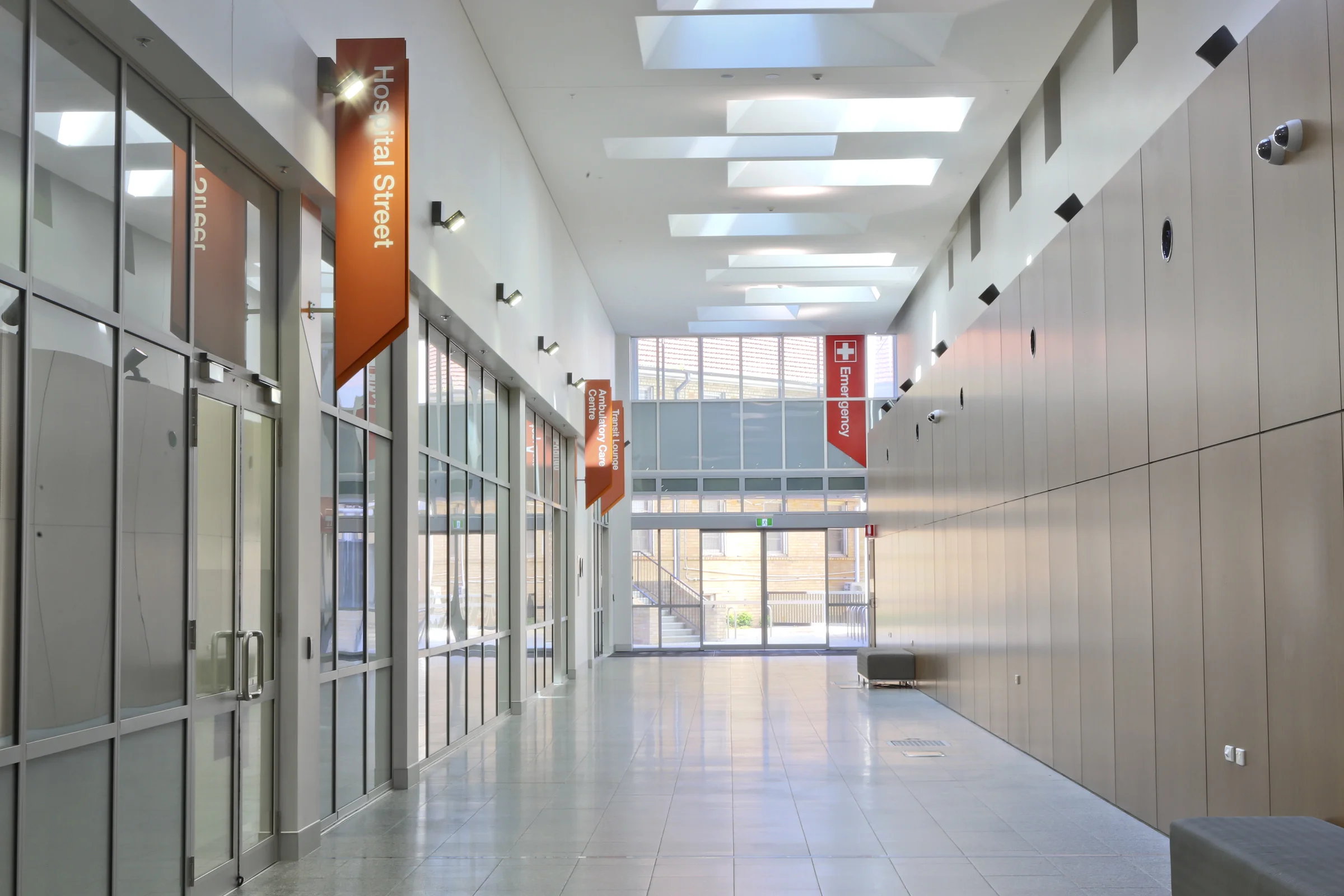
Wollongong Hospital, like many hospitals that grow over time, needed more beds, theatres and intensive care. The construction of the new elective surgery building saw the relocations of the main entry and information reception as well as the addition of a new lift core. A new wayfinding strategy was required to tie the new expansion to the existing hospital while maintaining a consistency and legibility between the different spaces. This was achieved through the use of colours, new environmental graphics and signage that could be applied throughout both the new and old buildings.
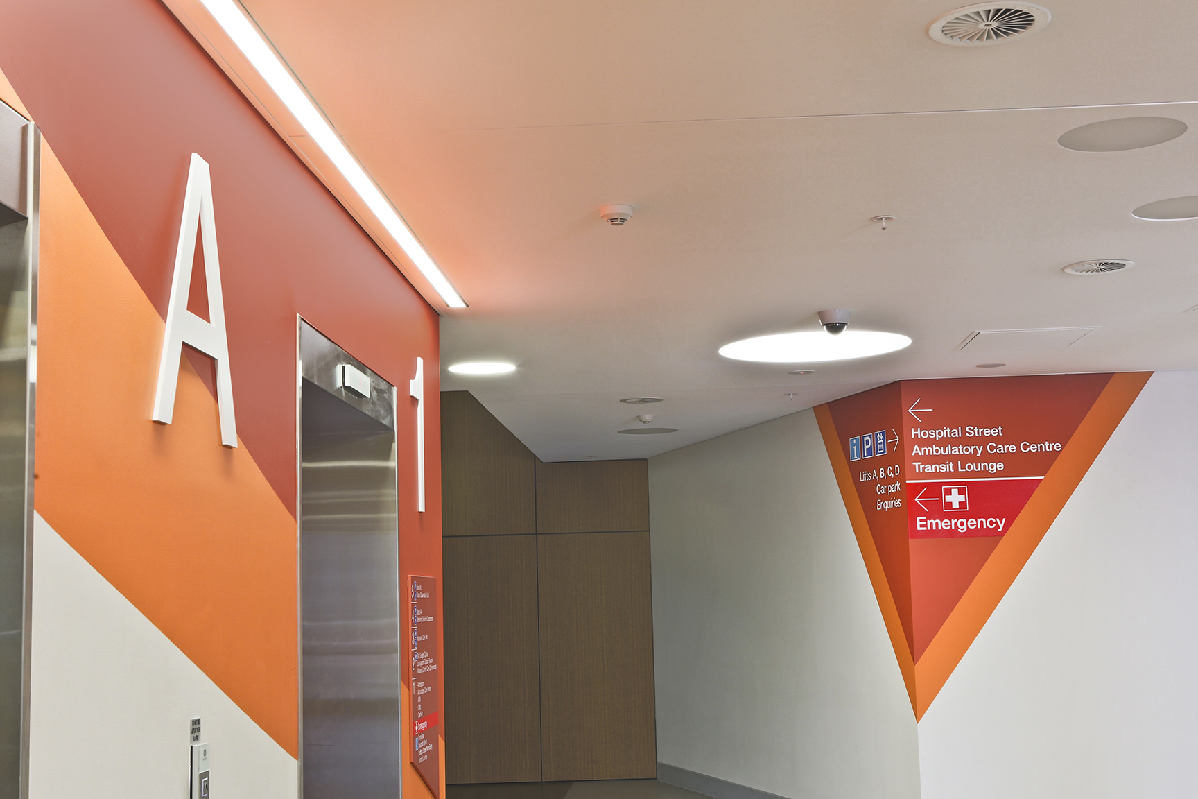
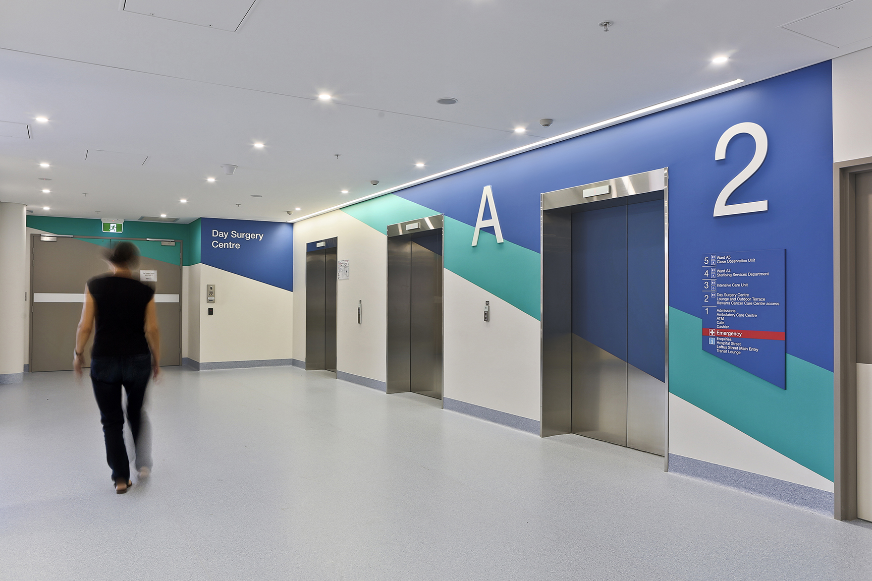
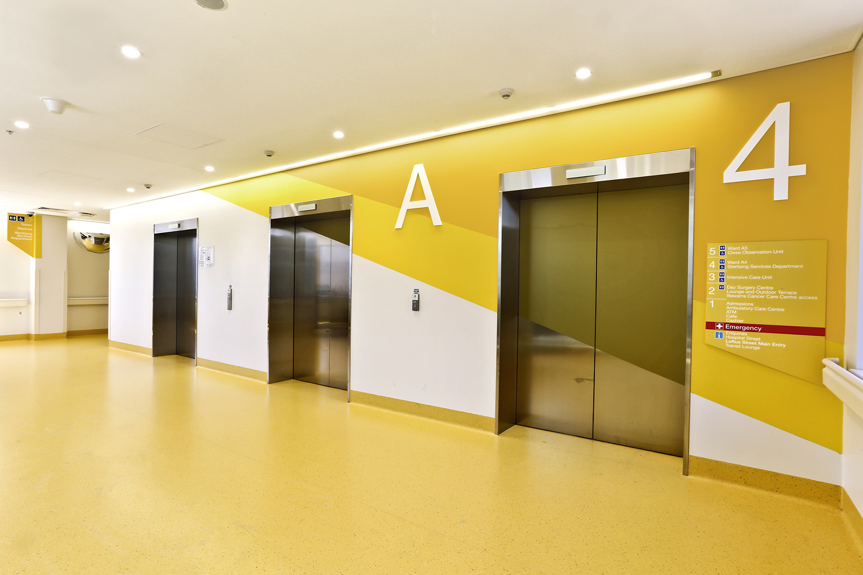
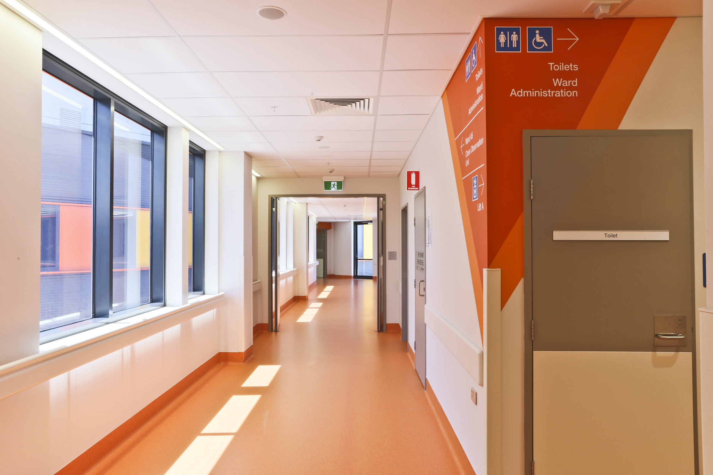
Wollongong’s location on the east coast of NSW, snuggled below a lush rainforest mountain escarpment and bounded by sandy beaches and ocean, inspired the colour selection for the design. Browns, blues, oranges and yellows were chosen not only to create distinct and memorable spaces, but also to connect with the building’s existing colour palette and environment. We decided to reinforce this theme and designed environmental graphics with complimentary paint colours for level identification whilst using graphics to easily identify the man entry and the different lift lobbies.
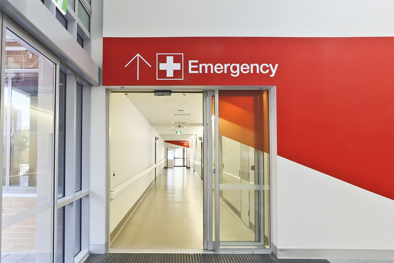
Painting the walls with the angular shapes broke away from the traditional black and white hanging slat approach seen in hospitals. We saw the large white walls surrounding the lift doors as perfect canvases for the use of bold and strong colours. We wanted them to be memorable for hospital users and reinforce each lift lobby as a landmark location. The strong shapes applied to the walls balanced the white spaces, reflecting colour into the spaces. The lift doors were incorporated by using vinyls that were CMYK printed to match the paint specification.
Whilst selecting the colours we had to ensure that contrast for the lettering was not compromised and that legibility was very good for signage messages, yet maintaining purposefulness of the colour strategy and a striking design.
Search for similar projects:
